How To Make A Quad Chart In PowerPoint
Are you looking to make your PowerPoint presentations more organized and visually appealing?
One effective tool you can use is a Quad Chart. In this article, we will explore what a Quad Chart is, why you should use one in your presentations, and how to create one in PowerPoint.
We will also provide tips for making an effective Quad Chart, examples to inspire you, and common mistakes to avoid.
Let’s dive in and elevate your presentation game!
Key Takeaways:
- A quad chart is a visual tool that can effectively organize and showcase information in a PowerPoint presentation.
- Using a quad chart in PowerPoint presentations can help to compare and contrast data, as well as highlight key points for the audience.
- Creating a quad chart in PowerPoint is easy – simply insert a table with four cells, customize and add data, and format the chart for a professional look.
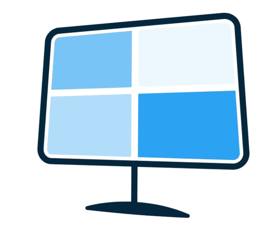
What Is A Quad Chart?
A Quad Chart is a visual aid commonly used in PowerPoint presentations to organize information and data into four quadrants, allowing for effective presentation of key points.
Quadrants act as distinct sections within the Quad Chart, each dedicated to a specific category or aspect of the topic at hand. By structuring data this way, viewers can quickly grasp the main ideas without feeling overwhelmed by a sea of information.
Graphs and charts within a Quad Chart offer a visually engaging way to represent trends, comparisons, or progress. This visual aspect helps create a more engaging presentation that can capture and maintain the audience’s attention throughout.
When creating a Quad Chart, consider using various chart types such as bar graphs, pie charts, or even timelines to enhance the clarity and impact of the information presented. These visual aids not only make the data more digestible but also add a professional touch to your presentation.
Why Use A Quad Chart In PowerPoint Presentations?
Using a Quad Chart in PowerPoint presentations offers a structured approach to displaying data and information, aiding in better visualization and comprehension.
Quad Charts are particularly effective for SWOT Analysis, as each quadrant can be dedicated to Strengths, Weaknesses, Opportunities, and Threats, providing a clear and concise overview.
The use of different shapes and colors within the Quad Chart can help emphasize key points, making it easier for the audience to grasp the information presented.
By incorporating visual aids such as graphs, charts, and icons, complex data can be simplified and made more engaging, ensuring that the audience remains attentive and understands the insights being conveyed.
Organize Information
Organizing information using a Quad Chart helps in structuring and presenting data clearly and concisely, facilitating easy understanding.
Quad Charts are particularly handy when dealing with extensive information as they assist in breaking down complex data into manageable parts. By dividing the content into distinct Quadrants, it becomes easier to categorize and arrange information effectively. The visual aspect of these charts plays a crucial role in enhancing comprehension, making it simpler for the audience to grasp the key points at a glance. Utilizing Quad Charts can help you create a structured format that guides viewers through the data systematically, allowing for better retention and engagement.
Compare and Contrast Data
Comparing and contrasting data using a Quad Chart allows for a visual representation of similarities and differences, aiding in insightful analysis.
When utilizing Quad Charts, the utilization of graphs and quadrants plays a crucial role in providing a comparative analysis. Graphs enable clear visualization of numerical data, enhancing the comprehension of trends and patterns within the information presented. On the other hand, quadrants help in segregating data into distinct sections, facilitating a structured comparison between different sets of data.
The visual impact of such comparisons cannot be overstated. By incorporating visual aids like charts, diagrams, and illustrations, Quad Charts significantly enhance the accessibility and readability of complex data. This visual representation not only simplifies understanding but also highlights key insights that may otherwise be buried in raw data.
Highlight Key Points
Utilizing a Quad Chart to highlight key points in a presentation helps in emphasizing critical information and guiding the audience’s focus.
Quad Charts are particularly effective as they offer a visually appealing way to present data. Dividing the information into four distinct sections allows for concise and impactful content delivery. To make the most of Quad Charts, consider using contrasting colors to differentiate between sections and focus on using brief bullet points or key phrases rather than lengthy paragraphs. This format not only enhances readability but also helps in keeping the audience engaged and attentive.
How To Create A Quad Chart In PowerPoint?
Creating a Quad Chart in PowerPoint involves several steps, starting with selecting an appropriate slide layout and customizing the chart to suit your data presentation needs.
Once you have chosen the right slide layout, proceed by adding a table to the slide. To do this, navigate to the ‘Insert’ tab, click on ‘Table,’ and select the desired number of rows and columns.
Customizing the chart comes next, where you can modify the colors, fonts, and styles to enhance the visual appeal. It’s crucial to follow tutorials and instructions diligently, ensuring that your Quad Chart effectively conveys the information.
Utilizing templates can also streamline the process, saving time and effort while maintaining consistency across multiple slides.
Open PowerPoint and Choose a Slide Layout
To create a Quad Chart in PowerPoint, begin by opening the software and selecting a suitable slide layout that accommodates the chart’s design.
Choosing the right slide layout is crucial as it sets the foundation for the Quad Chart’s structure. Opt for a layout that provides ample space for four distinct quadrants to be presented. This will ensure that your information is organized and visually impactful, enhancing the overall effectiveness of the chart.
Insert a Table with Four Cells
After setting up the slide layout, insert a table with four cells to establish the foundation of your Quad Chart, allowing for data segmentation and organization.
These four cells form the core structure of the Quad Chart, representing the Quadrants where information will be strategically placed for effective visualization and comparison. By segmenting your data into these distinct sections, you create a clear and organized layout that enhances the audience’s understanding of the presented data. Remember to label each quadrant appropriately to guide viewers through the information you are sharing. This step ensures that your Quad Chart is not only visually appealing but also serves its purpose of conveying crucial data with clarity and precision.
Customize the Table
Customizing the table in your Quad Chart involves adjusting the layout, formatting, and design elements to enhance the visual appeal and clarity of the chart.
These customization options are vital as they allow you to tailor the Quad Chart to your specific audience, making it easier for them to grasp the information you are presenting. By tweaking the colors, fonts, and sizes of different elements, you can create a cohesive and engaging visual narrative.
Furthermore, customizing the table enables you to highlight key data points, emphasize important trends, and engage viewers’ attention effectively. Such design adjustments not only enhance the aesthetic appeal of the chart but also significantly impact its overall usability and effectiveness in conveying complex information smoothly.
Add Data and Information to Each Cell
Populate each cell of the quad chart with relevant data and information, ensuring that each quadrant represents distinct content for effective presentation.
When filling out the Quad Chart, aim for succinct details that provide a clear overview in each quadrant. Utilize keywords or bullet points to emphasize critical information, ensuring easy comprehension. Remember that the purpose is to convey key points efficiently, so avoid unnecessary jargon or complex explanations.
By adding data to each cell, you enhance the visual impact of the chart and make it more engaging for your audience. Consistency in the level of detail across all quadrants will maintain coherence and facilitate comparison between different aspects of your project or presentation.
Format and Design the Quad Chart
Finalize your Quad Chart by focusing on formatting and designing elements, ensuring a cohesive and visually appealing presentation on your PowerPoint slide.
To enhance the visual appeal, consider using a consistent color scheme throughout the Quad Chart, with subtle variations to highlight key information. Utilize Template options available in PowerPoint to maintain a professional look and feel. Incorporate editable shapes and text boxes for easy customization and updates. Pay attention to alignment and spacing to create a clean and organized layout. Utilize headings, bullet points, and numbered lists to improve readability, guiding the viewer’s eye through the content seamlessly. Include relevant icons or graphics to visually represent data and make information more engaging. Remember, a well-designed Quad Chart can make a significant difference in captivating your audience and effectively communicating your message.
Tips for Making an Effective Quad Chart
Crafting an effective Quad Chart requires attention to detail, the use of visual aids, appropriate fonts, and color choices to enhance the chart’s impact.
When selecting visual aids for your Quad Chart, opt for clear graphics that complement your data, guiding the viewer’s understanding. Utilize graphs and charts effectively to convey complex information succinctly, ensuring they are easy to interpret at a glance.
- Font selection plays a crucial role as it influences readability. Choose legible fonts in a consistent style and size throughout the chart to maintain coherence and professionalism.
- Color choices should be purposeful, using a limited palette to highlight key points and create a visual hierarchy. Avoid overwhelming the audience with excessive colors and opt for a harmonious color scheme.
Keep it Simple
Simplicity is key when creating a Quad Chart; ensure that the design, data presentation, and visual elements are straightforward to comprehend for the audience.
By adopting a minimalist approach, you can elevate the effectiveness of your Quad Chart. Utilizing a clean layout, limited color palette, and strategic use of white space can enhance the overall visual appeal and make the information more digestible.
For instance, reducing text to essential points, incorporating simple icons for data representation, and maintaining a balanced composition can help grab the audience’s attention instantly.
Use Visual Aids
Incorporate visual aids such as graphs, icons, and images in your Quad Chart to enhance data visualization and make complex information more accessible.
Visual aids play a crucial role in improving the effectiveness of Quad Charts by presenting information in a more engaging and easily digestible manner. Visual aids help in breaking down complex data sets into comprehensible chunks, allowing the audience to grasp the key points quickly. Graphs offer a visual representation of numerical data trends, enhancing the viewer’s understanding. Icons, on the other hand, can simplify and direct attention to important sections within the chart. Including relevant images further enriches the content, making it visually appealing and aiding in memory retention.
Use Appropriate Fonts and Colors
Choosing appropriate fonts and colors is crucial for a Quad Chart; opt for readable fonts and a color scheme that complements the design and enhances visual appeal.
Fonts play a significant role in conveying information effectively. Serif fonts like Times New Roman are great for print, while sans-serif fonts such as Arial are easier to read on screens.
Regarding colors, use a harmonious palette that aligns with your brand and enhances readability. Bright colors can grab attention but should be used sparingly to avoid overwhelming the viewer. Consider color psychology when selecting shades to evoke specific emotions or associations. A well-thought-out combination of fonts and colors can elevate the overall aesthetic and impact of your Quad Chart presentation.
Examples of Quad Charts in PowerPoint
Explore diverse examples of Quad Charts in PowerPoint presentations, showcasing different styles, layouts, and applications to inspire your chart creation.
Quad Charts are widely utilized in project management, business analysis, academic research, and various other fields to summarize complex information. Organizing data into four quadrants allows for easy visualization and comparison of key metrics. These charts are not only visually appealing but also highly effective in presenting information in a structured manner.
When creating a Quad Chart, it’s essential to choose a suitable Template to streamline the design process. Many online platforms offer free Quadrant Chart Templates that users can easily customize to their specific needs. These templates often come in different styles and color schemes, making it convenient for individuals to create professional-looking Quad Charts without starting from scratch.
Common Mistakes to Avoid in Making a Quad Chart
Identify and steer clear of common pitfalls when creating a Quad Chart to ensure a polished and impactful presentation that effectively communicates your data and information.
One common error to avoid is overcrowding the Quad Chart with excessive data points, which can overwhelm the viewer and dilute the key message. Aim for a balance between providing sufficient information and maintaining visual clarity.
- Avoid using too many colors in your Quad Chart as this can create confusion and distract from the main content. Stick to a cohesive color palette that enhances readability and highlights important data.
- Align your design elements properly to create a clean and organized layout. Misaligned text, charts, or labels can disrupt the flow of information and make the Quad Chart appear cluttered.
Conclusion
Quad Charts in PowerPoint presentations offer a compelling way to organize data, highlight key information, and enhance visual communication for effective presentations.
These Quad Charts are particularly beneficial in condensing complex information into a concise format, making it easier for the audience to grasp important points at a glance. By utilizing Visual Aid elements such as charts, graphs, and images, Quad Charts enhance engagement and retention rates during presentations. The structured layout of Quad Charts promotes a logical flow of data, aiding in storytelling and keeping the audience focused on the key message. Leveraging Quad Charts for data visualization can significantly improve the impact and effectiveness of your presentations.
References
Consult the provided references for further insights into Quad Chart creation, PowerPoint tutorials, SWOT Analysis strategies, and advanced data visualization techniques.
When diving into the world of Quad Charts, it is essential to understand the fundamentals of creating compelling visuals that communicate your message effectively. By incorporating SWOT Analysis and leveraging data visualization concepts, you can elevate the impact of your Quad Charts. Whether you are a beginner looking to enhance your PowerPoint design skills or an advanced presenter seeking to refine your presentation techniques, the following resources can serve as valuable guides:
- Online tutorials on Quad Chart creation
- PowerPoint design masterclasses
- SWOT Analysis templates and strategies
- Data visualization tools and techniques
These references will not only assist you in crafting visually appealing Quad Charts but also help in honing your overall presentation skills.
Frequently Asked Questions
1. How do I make a quad chart in PowerPoint?
To make a quad chart in PowerPoint, start by creating a blank slide and dividing it into four equal quadrants using the gridlines or by manually inserting shapes.
2. What are the benefits of using a quad chart in a presentation?
A quad chart allows you to present four related pieces of information or data in a visually appealing and organized way, making it easier for your audience to understand and retain the information.
3. Can I customize the design of my quad chart in PowerPoint?
Yes, you can customize the design of your quad chart in PowerPoint by changing the colors, fonts, and shapes of the quadrants to fit your presentation’s overall theme or style.
4. How do I add data or information to each quadrant of my quadchart?
To add data or information to each quadrant, simply click on the text boxes or shapes and type in your content. You can also copy and paste data from other sources into the quadrants.
5. Is it possible to add images or charts to my quad chart in PowerPoint?
Yes, you can insert images or charts into your quad chart by using the “Insert” tab and selecting the appropriate option. This can make your quad chart more visually engaging and informative.
6. Can I use a quad chart for any type of presentation?
Absolutely! Quad charts can be used in any type of presentation, whether it’s for business, education, or personal purposes. They are versatile tools that can effectively convey information in a concise and organized manner.